menoreh tinta, tanpa suara
Pantone; color of the year
Hey there fellas! As you can see on my Tagline, I inserted “fashion” as one of my topic to write in this blog. So without any further due, let’s get started!
So in this post I want to talk about Pantone, does any of you ever heard the word “Pantone” yet? When I search about the definition of Pantone, here’s what comes up:
Pan·tone
ˈpantōn/
noun
trademark
noun: Pantone; plural noun: Pantones
1. a system for matching colors, used in specifying printing inks.
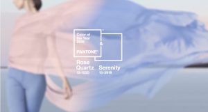
Why did I choose to talk about Pantone than any other colors? Well, you know what Pantone is the color of the year of 2016! For the first time Pantone introduces two shades, Rose Quartz and Serenity as the Pantone Color of the Year 2016. Rose Quartz is a persuasive yet gentle tone that conveys compassion and a sense of composure. Serenity is weightless and airy, like the expanse of the blue sky above us, bringing feelings of respite and relaxation even in turbulent times. The combination between the two of it makes a very elegant pastel hues. It demonstrate an inherent balance between a warmer embracing rose tone and the cooler tranquil blue, reflecting connection and wellness as well as a soothing sense of order and peace.
For some of you who are curious about how to mix and matching these color with your clothes, this picture below might help, enjoy!
(source for all pictures: www.pinterest.com)
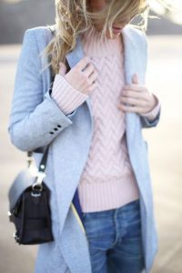
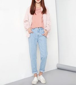

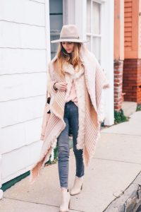
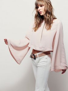
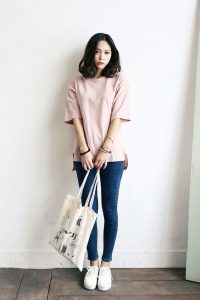
Wooow, I really like this style. The color is just so nice. Loveeeee!!
iya pink ungu so oenjoeh
oohh jadi warna2 kayak gini namanya pantone toh. thanks bgt infonya diinn
wah, kayak pastel gitu ya warnanya. so nice and beautiful 🙂
bedanya warna pantone sama warna pastel apaan?? lucuuk deh ^^
LUCUUUUUUUUUU